A screenwriter bursts into his agent's office. "I have a great idea for a new picture," he enthuses. "We do a remake of The Wiz. Only with white people!" Clichéd Hollywood joke, sure, yet pretty much on point with regard to current trends in art and music. The mash-up, dub, remix, redux, or whatever you want to call it, has replaced the "appropriation" strategies of the 80s. It has morphed into something called Zombie Formalism that for better, or worse, is now seen as a legitimate art movement.
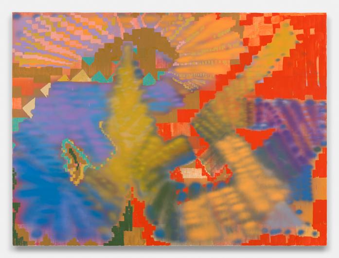
Mitchell-Innes & Nash is showing the paintings and works on paper of Keltie Ferris. These very large, high-keyed, color-filled canvases are warmly inviting on first viewing. Bright reds and blues dominate. The arching motif is brushy passages of paint, checkerboard squares, and general noodling around with the brush over airbrushed planes of color. The press release notes, "Ferris explores painting as a personal index," and indeed, there is something deeply felt about these works -- something likable and genuine that was lacking in much of the work in the Forever Now show last spring at MoMA. In the MoMA show there was indeed a zombie-like quality to much of the show's paintings -- a feeling of deadness and mere object making. Nicole Eisenman and Christopher Williams were the only exceptions to the walking-dead rule there. Here, Ferris manages to vivify her paintings by following the lead of Williams. In "Story" (2015), she first paints a stack of vertical bands, which are covered by vertical pulls of paint, which are fogged over by a Jules Olitski-like mist of airbrushed pigment, which is then doodled over with scratchy, felt-tip-pen-like green strokes. In "Marksman" (2015) a similar technique references Christopher Wool and Arthur Dove; other works suggest passages of Jonathan Lasker, Ross Bleckner, Gerhard Richter, and Amy Sillman, as well as African textiles and Amish quilts. When these elements come together, as in "Cleopatra" (2015) the result is quite likable, like an Atari version of a Marsden Hartley.
The problem at the center of this type of art-making process is not the lack of original material. "Voodoo Problems" is a great song. Hendrix is great. Jay-Z is great. Put them together and you have a sonic Reese's peanut butter cup of greatness. Nor is the use of the repetitive mark-making, the quilting together of random paint strokes particularly compelling. Shows of McArthur Binion and Jack Tworkov (at Galerie LeLong and Alexander Gray Associates, respectively) are running concurrently on the same block and offer an instructive lesson on how this material can be based on a much stricter, disciplined approach to great effect. No, there seems to be a greater problem, which might be the fault of we, the audience, as much as it is the artists. We are often accepting of mediums of convenience, things that are good enough rather than more difficult and better. We laugh at memes and Youtube postings, talk to people on cell phones over networks whose sound quality would be mocked by Alexander Graham Bell, and often view art exhibits only on our laptops. Information theory tells us that the amount of bits needed to communicate certain types of content (like that hilarious dog that really wants a cheeseburger) on the internet can be much lower, and lower still, as the viewing audience becomes adapted to interpreting content with less data. If we only need to extract the information from a phone conversation, like listening to a computerized answering service from tech support in India when your computer is down, then maybe good enough is ok. Or maybe not.
When looking at painting, specifically post-Frank Stella painting, there has been a similar decline in levels of painterly qualities that sometimes has left us feeling that something has gone missing. Stella himself wryly observed that "what you see is what you see," though in his work he replaced a certain romantic approach to painting with geometry, and in doing so merely replaced a certain appreciation of painterly beauty with the beauty of geometry and color.
All of this is not, in the end, to disparage the projects of Ferris. Indeed, this type of painting obviates criticism to some degree. A more clever review of this show would have consisted of a William S. Burroughs cut-and-paste mash-up of the reviews of Clement Greenberg, Rosalind Krauss, Harold Rosenberg, and Peter Schjeldahl. But perhaps we should take away something instructive from all of this. If television has taught us anything lately, it is that we should fear the walking dead.
