Zap: Masters of Psychedelic Art, 1965-1974
Andrew Edlin Gallery, NYC
Through June 25, 2011
I was an impressionable teen in the late 1960s, and Zap commix brought me a front row seat, albeit a twisted one, to a world of drugs, sex, psychedelia, violence, brilliance, and stupidity. As mentioned in essay by Gary Panter and Chris Byrne, the exhibition's curators state how the Zap artists "dared to critique and satirize the messy cultural and social network in progress." The Zap artists let it all hang out, literally and figuratively, and they targeted their like-minded peers as well, making it all the more compelling.
The show opens with a painted plywood cutout of "Snoid" (1974), who happens to be one of Crumb's more sex-obsessed characters. Hanging here in this exhibition, Snoid becomes a harbinger of the wildly intense expressions that you will see and experience as you work your way through the exhibition.
Along a hallway that leads to the main gallery space is a wall lined with the works of Robert Williams in the form of an eight-page presentation of "Masterpiece on the Shithouse Wall" (1973). The visceral effect that Williams creates in these works is immense. He is a master draftsman in every respect, which includes the dying art of font creation. There’s the overwhelmingly bizarre and intense narrative; the density of precise detail rendered in black and white ink; character creation and settings, and the way the layout is built amidst a border of bones, rocks and branches, which is all is over-the-top mesmerizing.
Also in the exhibition is one example of the work of Victor Moscoso in the form of a page titled "Death & Einstein" (1968). It appeared in Zap, No. 2, and it breaks the narrative mold as it can be read in any way or direction. It's like an elaborate three-tiered wedding cake that tastes the same no matter where you take your slice. It’s all good.
Then there is a five page work by Gilbert Shelton and Tony Bell called "The Hog of Steel Wonder: Wart-Hog Opens a Concession Stand" (1967). It is an hysterical story about not knowing your market, and making a mess of it. But it’s the futility of the story’s main character that is most endearing, while the relatively effortless, loose drawing style that makes for an incredibly comfortable read is what inevitably draws you in.
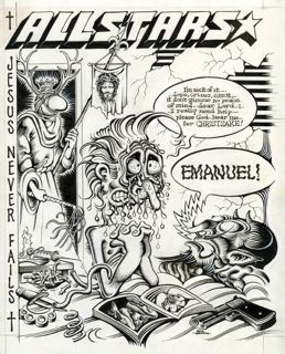
The fluidity of line and form, and the sense of a total and complete composition in the single-setting pages of Rick Griffin are unforgettable. The pièce de résistance is "All Stars cover" (1970), where we see a sweaty and suffering heroin-, cigarette-, and sex-addicted figure praying to God, "I really need help…..please God…hear me…fer CHRISTSAKE!." Very funny. What really sets off the appeal of this page is the variations in the line thickness and direction, a feature that is set off nicely by the black and white stripes in the background that represent plaster slats. Additionally, the way in which the lines of the devil's head inexplicably migrate up and around his speech bubble brings in thoughts of a freer, more meditative form of expression.
 The art of Spain Rodriquez (image left, "Scenes from Contemporary Life," ink on paper, 1973) reminded me quite a bit of the work of Joe Coleman. They share the same level of clarity in their rendering of violence, and, for lack of a better word, there is a common theatrical stiffness in their anatomy. Rodriquez also mixes media as he employs collage and benday: a pre-made mechanical detailing such as dots or patterns which was once sold on sheets of clear acetate to everyone from comic book artists to magazine and newspaper illustrators. The selection was endless and all the artist had to do was cut out a desired shape, then press-on apply to a drawing to enhance or define surface or texture.
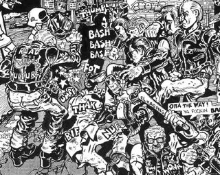
In the few examples here, S. Clay Wilson's dominatrices rule the roost. Filled with brutal decapitations, enslavements, and eviscerations, Wilson’s art leads his readers through an all-over whirlwind of hell on earth. What draws you into these works is the heavy-handedness of the figures, their expressions, their very presence on the page that seems to exceed the two-dimensional realm. Wilson's art is even denser than Rodriquez's thrill-packed scenes, yet they are so clearly formed, and drawn with little or no concern for organization on any level, that they convey both flatness and depth.
There is one full-color cover by Wilson and Crumb from 1969 titled "Art and Artists" that is as over-the-top as any piece in the show. This leads us last but not least to the offerings of Crumb. What I find particularly appealing about the art of Crumb is the softness of his forms, whether he is rendering a car, a building, or a full-figured female, there's a fluid easiness of the subject's form and movements. Crumb also knows the exact amount of detail required to move his narratives from frame to frame, demanding little effort from the reader. This is in stark contrast to most of the other works seen here. This is not to say all the work here isn’t equally appreciated or understood. It's that Crumb is the best at getting into the collective consciousness of popular culture because he creates such memorable figures such as Mr. Natural, Fritz the Cat, and most of all Keep on Truckin' that you can carry with you for the rest of your life.
All the work in this exhibition is as politically incorrect as one can imagine, but this is the way of underground thinking: to work not outside but under the box -- beneath the bloody saliva and steaming dog feces that riddle the city streets and sidewalks of a chaotic world.