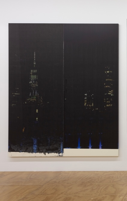
Wade Guyton: Supply Chain
Rena Spaulings Fine Arts, NYC
Thru Jan 30, 2022
Reena Spaulings Fine Arts in Chinatown is deliciously grungy. It's on the second floor over the stalwart Chinese restaurant Wu's Wonton King. The exposed beams aren't noticeably cleaned. I love the conduit running along the ceiling and the utterly beat up silver painted walls.
Wade Guyton has a new show there and if you don't look too closely, then the art and the space are a location scout's dream for a Netflix movie scene where an overly buttoned-up collector comes to terms with the messiness of Modern Art.
Wade Guyton began his career with some punchy pieces that took a simple broken "X" and printed on top of it over and over until the surface took on a new kind of physicality. It was more than just a print.
Sometime in the early '00s inkjet printers had started making things that detailed and colour wise could stand alone as Art. But overly slick production like Richard Prince's hot girl selfies made you ask, isn't this just like advertising? Guyton's work told us that the technology must serve the Art, not the other way round.
This is a show of high quality prints wrapped around supports that give them a solid "painting" look. The images run from the semi-abstract; two Ben Day dottish pieces, a glitched out floorboards, almost '70s wallpaper-like pieces to more literal images -- one of his studio, the cover of the New York Times, a view of City Hall at night (I think) perhaps is from his studio window.
Instead of direct printer manipulation, he seems to be enjoying pushing the "mistakes" that they make. In some the machine seems to be drooling too much ink. The building print has "lines". There are frequent black and brown smudges that happen when you have overloaded printheads.
The look of the show has a revelatory quality. He brings the studio and the tools he uses into the picture. It's equivalent to how the gallery has been designed so that the supports that hold the showing walls to the building walls are clearly visible in a lattice of struts. A nod back to '90s Deconstructivist Architecture but without any of those annoying "interventions" that your client might bang their head on.
But Guyton making a print of his printer is unconvincing. His exposition of his studio practice is employed as evidence of fearlessness. An attempt at deconstructed honesty. But now the janky printer isn't an "art maker," it's just being used to decorate the surface.
Random ink residue on otherwise perfect prints just looks like a "grunge" condiment. Not enough to annoy your collectors but just enough so that your "paintings" can be read as more than a "common-or-garden" print.
Glitch and printer manipulation can feel very interstitial, as if the artist is not eager to step outside of his/her/their immediate surroundings. Even the abstract pieces look as if they've been happened upon during some computer or printer error and extrapolated from to create an image. Apparently for his show in Los Angeles he used images of "the troubles" of 2020. I wish that some of them were here.
I mean, maybe I'm wrong. Maybe it's OK. Jasper John's best work of the '60s is very navel gazey. It's all about the studio. The real problem with Guyton's work is that once you get past "the look" and "the issues," print vs painting vs photograph, it's not very interesting compositionally or colour wise.
The image is bang in the middle of the picture and the palette that includes faded tans, dull blues and hot orange, while oddly vintage like deadstock Polaroid film are neither uplifting or skillful, they're just stylish.
If you're really going to deconstruct your art, make it about the surface, so that you can more easily get at what's behind. Then you really need a conceptual Easter egg inside of it. Without one the whole thing looks hollow.
