Elizabeth: Trawling around today's Chelsea galleries recently made David and me mindful of the days when we would wander the streets of SOHO looking at art in some pretty great galleries. After the sun set, there were no Comme des Garçons or Cookshop to light the way home, but thin bedraggled men filling dumpsters with compacted shredded rags from the remaining sweatshops that dotted the area south of Houston Street. Frankly most of what was below Houston in the late 1970s and 80s was pretty creepy, outside of a few old standbys. Still, if you were there for the art, music or dancing, its edginess was exciting and romantic. It was also affordable to take a cab out of there -- if you could find one.
David: Yeah, today’s Chelsea is fast becoming the Epcot center for flashy haut bourgeois boutiques, signature architectural confections designed to blot out the light and in time, no doubt, the views from the High Line, that originally brought developers to the area and are now forcing long established businesses and galleries to leave. One of these is headed by the highly esteemed gallerist Betty Cunningham, who takes a real interest in her artists, and cares as much about their careers as she does about making sales. She told me she is very happy to be downtown in the LES, a real neighborhood instead of a warehouse district, and near to where she started, in a gallery over Fanelli’s Bar in SOHO.
Elizabeth: I was thrilled when David ushered me into her new location at 15 Rivington Street, opposite Freeman's Alley in the Lower East Side. Her new space has two levels with wide plank fruitwood flooring extending back from the entrance and flanked by large recent works in oil and watercolor by Philip Pearlstein in honor of his 90th birthday. Pearlstein is a perennial favorite in my book, his works are at some points breathtaking and he manages to continue to surprise and comfort me at the same time. Two paintings in particular were standouts in the downstairs space. As I first got a glimpse of them from the end of the upper level, David pointed to the large painting, Two Female Models with Legs Crossed and Kazak Rug, 2013, (image below) on the back wall and exclaimed: "It's one of his very best works. And he can still pull it off at ninety!" It is and he can.
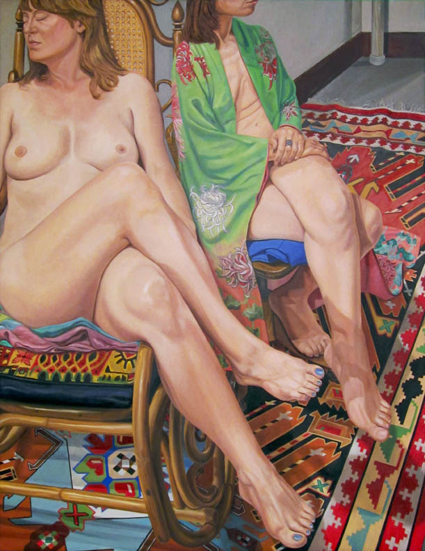
David: "You know, despite all his success, I think Pearlstein is largely misunderstood as merely a 'cool, eye-ball realist'." In fact, he is one of the more complex and paradoxical of contemporary artists: his work is perceptually executed but conceived of abstractly, notice the crossed axis here. He focuses on the human figure without sentiment but often conceals a sly humor in his orchestration of forms, which often remind me of his early engagement with Francis Picabia. Pearlstein is the anti-humanist humanist; his work’s facture has a deadpan inflection, like the voice of Chet Baker. Still, for all that, his central achievement is his re-examination of the nature of our looking, and through the close-focus mapping of what we see, a new way of experiencing the world appears; that cannot be said of his recently departed competition, Lucian Freud. He is the perfect artist for an extended dual location show that is both a Hello and Goodbye.
Elizabeth: Well I simply refuse to say goodbye without adding that there is a special and subtle pleasure in Pearlstein’s work that people frequently don’t see. It is a lifelong engagement with the same room, the same light, models, rugs, objects, etc., that reveal in their nuanced differences an inexplicable richness, a life lived in looking, as you put it. Corrupted by today’s internet, many onlookers may mistake 50 different Damian Hirst pictures as serious variations on a theme, although they are in reality merely rote repetitions. And you know how much I like everything Pop!
It was then that David and I strolled over to the just opened Morgenstern's Ice Cream shop, across the street at 2 Rivington. Sincerely, this was some of the best sorbet I have ever had, made spectacular by the intense color of my handmade treat. It is a foodies' fashion must, as cool as the Lower East Side.
David: After enjoying our cones at Nicholas Morgenstern’s across the street, we ventured on to Chelsea where most of the established galleries are still active. DC Moore gallery is sporting works by Robert De Niro, Sr. (image, top) to coincide with the HBO showing of a documentary on the artist, featuring his son reading from his father’s journals. De Niro was part of the generation that Pearlstein was reacting against when he was defining his own practice; in many ways they are opposites, and yet they are united in the commitment to working from life. A selected survey of works from 1947 to 1989, were on view and there were a number of standout pieces. Although most of his early work was lost in a studio fire, the Untitled Abstraction, actually a still life from 1947-48, gives a clear demonstration of why he was highly thought of by Hans Hoffmann and others. The picture is taut with pictorial tensions opening up the space with vital painterly gestures that hold well against works in the back room by de Kooning and Kline.
Elizabeth: Well, I am so happy to see that DC Moore has helped to keep attention on De Niro, Sr.’s work and life as an artist. His work has such a great love of color; he was a real painter’s painter.
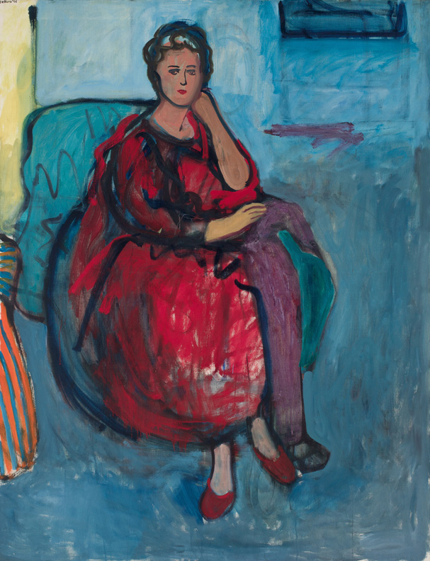
David: Several works from the early sixties were new to me and memorable, especially the large canvas, Woman in Red, from 1961. Where Pearlstein relies on the slowly-achieved tonal articulation of forms, De Niro is all about broad masses of color holding forms in space while locking those shapes into the surface. Executed with a seemingly casual spontaneity, De Niro achieved a lively evocation of the woman’s presence, elegant and a bit reserved. Here color does several things at once: it creates a mood and atmosphere, and it creates pressures that open up the space of the room’s blue field, pushing a bright yellow back and pulling forward the red dress and purple shawl. The contrast of blue-black lines against the red-orange brown of the sitter’s flesh gives the picture its psychological focus, while the ochre kid glove provides the nexus of the picture’s movements. Returning to the street, I mentioned my feeling for the large portrait to Elizabeth, which she liked as well.
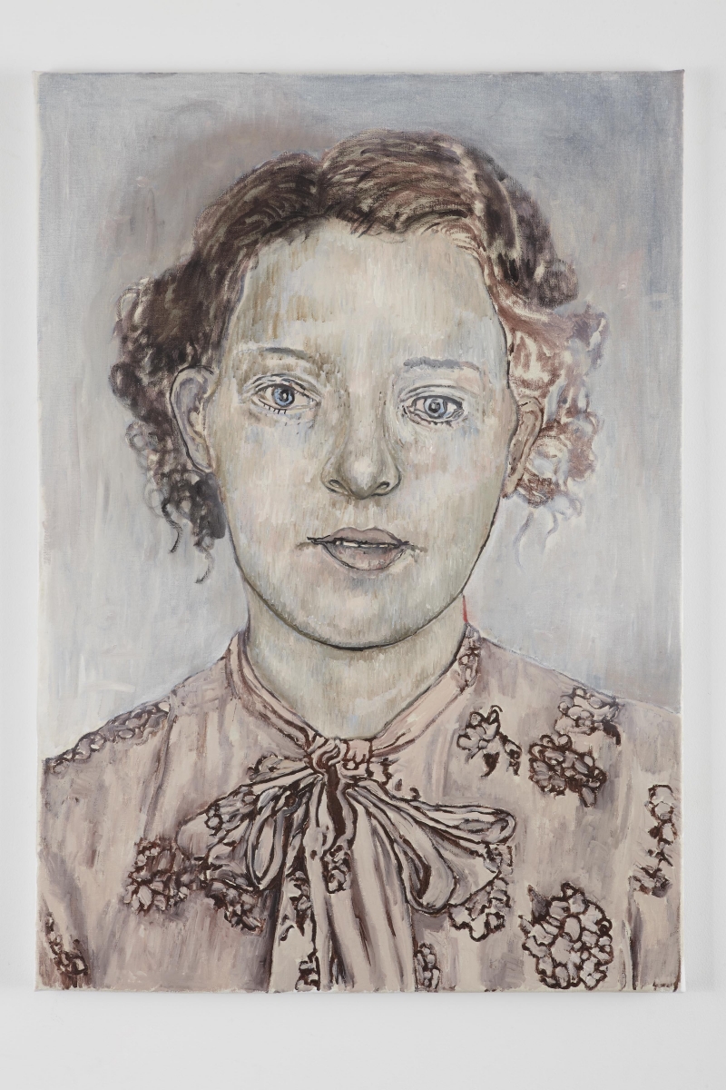
A few blocks away, we found ourselves at Marianne Boesky Gallery and were pleasantly surprised by our first viewing of portraits by an established Dutch painter Hannah van Bart. Drawing is the central expressive vehicle in these works; color is secondary to line and tone, mostly serving as an accent to off-white, taupe or grey tones. Drawn, or more likely projector traced from found photographs, these portrait heads and full figures have a nostalgic air, as if of people who lived seventy years ago, during the war. Van Bart has developed a few drawing mannerisms which give the features of her men and women a family resemblance; her lines vary between precisely confident, but without a searching quality, and mannered to appear quivery. If a bit illustrational, they nevertheless project an intriguing quality of enchantment.
 Elizabeth: I don't know about this show, David. I can’t say that I was dazzled but when von Bart hones in on a particular detail, it knocks my socks off. Then there are particular portraits that felt almost like gesture drawings that were equally amazing. Overall, she seems to be in the middle of something; I would love to see what her next move in the studio will be.
David: My favorite works were the portrait head of a Young Woman, 2011 and She Knows, 2013. Elizabeth also liked Doubt, 2013. The Young Woman (image left) has the kind of linear grace Foujita could sometimes give to his subjects and She Knows seem like an update on early Paul Delvaux, still they are not yet in a world. Before we left, we lingered over a Dutch catalog of her early work, clearly inspired by Georg Baselitz. The drawings there made it clear that von Bart can possess a real vitality in her drawing when she isn’t a slave to the photograph. We’ll have to wait for the next show.
Elizabeth: We walked down to 23rd Street and Margaret Thatcher Projects, where the Munich-based artists Venske & Spanle are showing hand-carved marble sculptures they call Smörfs. These well-crafted works are meant to be a new species of creatures with very sexy forms that are shown in this exhibit interacting or exploring various everyday objects that the artist couple has had in their home. Each work shows a creature’s curiosity by their tactile investigation of what goes on in the everyday world of humans.
David: Is Smörf the German word for Al Capp’s equally biomorphic creature the Shmoo? Or so it would seem, does anyone even remember Al Capp? In any event, these giant marble mollusks lean, against walls, stretch, grope, and droop about objects like the one hugging the bulb of a lamp. It involves a lot of carving to make these sculptures appear humorously playful; they are also a tad disturbing in their evocation of sexualized parasitic creatures. Looking at this work one wants to see them set out in force over the extensive landscape of a park or even a mock city dump where they would appear astonishing.
Elizabeth: If you are tempted to reach out and touch something -- well it is there. I’m never disappointed in Thatcher projects; her space is so inviting. Rarely have I been at Margaret’s gallery without street traffic coming and going. Venske & Spane's latest efforts are nutty and delightful.
I want to point out that here in Chelsea galleries tend to end up in these spaces due to dealer efforts, despite what has become a very rough environment for artistic creativity. For example, the Boesky space we visited earlier has been changed physically to accommodate several shows I have seen through the years.
David: Well you have introduced me to an interesting duo that also draws upon the great form tradition of Arp and Brancusi. I want to finish our stroll with a visit to Mathew Marks Galleries featuring works by a great contemporary original in this tradition -- the late ceramic sculptor Ken Price. Featured are his largest works, cast in bronze and lacquered in iridescent paint. While they are magical, the iridescent colors don’t have the same luminousness that his use of acrylic paints produced. Where the Smörfs remain one thing, Price’s sculptures continuously transform, as you move around them, revealing sensuous and sexual aspects with an almost hallucinatory giddiness; with a change of just 30 degrees a piece can change from male to female as in the stunning piece Percival, 2009, set off by itself in the small gallery on 22nd Street.
Elizabeth: Speaking of sexy, this show is sexy! Arp and Brancusi aside, this work falls into a particular type of organic work that I have not seen outside of artists who flourished in the 1960’s and 1970’s, mainly in that brief time when sex was glorious and an artist like Price understood this and was able to celebrate it. Even in a huge hollow and characterless white box, Price turns out works that are outrageously alive.
David: Oddly enough some of these biomorphic distortions bring me back to the shocking strangeness, the newness really, of the women’s legs in the large picture we saw by Pearlstein at the start of the afternoon. Who would ever link such different artists, but that is just what can happen on a day at the galleries.
Elizabeth: Back on the street, the force of the wind gusts made us look up at the menacing clouds darkening all around us. David was in one of his impish moods and pointed toward the sky, turning to me, he exclaimed: “Do you see it? It’s Donald Trump in drag on a broomstick, writing, 'Surrender Chelsea', in black smoke!”
What a nut. Just then, the sky opened with a first downpour; we were stuck under the High Line. After a while, we waddled like ducks over puddles to slip into the Half King, for a drink, because the sky was falling. It’s the end of the gallery season and like the weather, the atmosphere of the art world is changing; soon, we may be talking about a different New York Art World.
'Til next time. - Elizabeth Stevens & David Carbone
Ms. Stevens has been in Art and Antiques for 30 years, from representing her family's auction house in Cincinnati to Import Director at Hedley's New York in the early '90s to Salander O' Reilly Galleries, organizing art fairs and traveling exhibitions for more than 12 years. She is the former director of Yellow Bird Gallery in Newburgh, NY as well as the former Exhibitions Curator for the Thomas Cole House. She is now the owner of Elizabeth Stevens & Co. with offices in New York, New Jersey, and soon Florida.
Mr. Carbone is a painter, a critic, a curator and an educator. He has shown nationally in galleries and museums; written for Modern Painters and The Sienese Shredder anthologies, among other publications; occasionally appeared on NPR's Morning Edition with David D'Arcy between 1992-2005; and curated selected retrospectives. He is currently the director of graduate studies in studio arts at the University at Albany, where he teaches painting.