
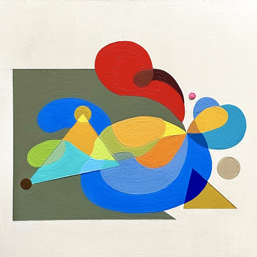
Whitney Hagen, the Newport painter of hard edges and imagined spaces, is bringing her first European solo show to Venice in two suitcases.
I had never seen anyone absorb the influence of the masters so quickly. Hilla Rebay and Kandinsky, in a painter this young? The press release for Whitney Hagen’s Chromatic Conditions, her first solo show in Europe, at the Castello 925 annex in Venice, calls the works “abstract 21st-century icons” that “glow like prisms for another world.” Her own statement speaks of “harmony, tension, emotion, and balance,” which is Kandinsky’s vocabulary almost word for word.
So I asked her. Do you think of these as icons? “Short answer no,” she said. She admires Rebay and Kandinsky, but she doesn’t load her own work with their weight. What she describes is quieter and stranger: small wood panels, some stacked, each a still image from a larger imagined space. She sketches in ballpoint on scrap paper, refines the design on an iPad, then transfers it to the panel in colored pencil. Everything she brought to Venice, none of it larger than twelve inches square, traveled in two hardshell suitcases.
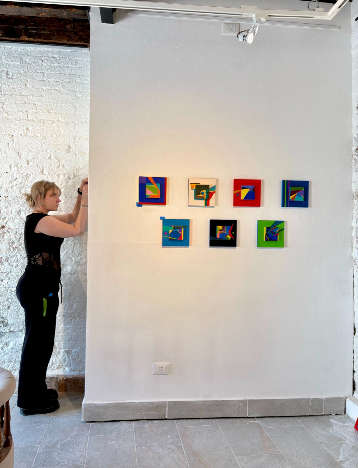
By day, Hagen is lead preparator at the Newport Art Museum, which is why she hung the Venice show herself. The newest work is already outgrowing the suitcases, at 20 by 20 and 30 by 30 inches, and her palette is widening to include pink. Here she talks about the lineage she does and doesn’t claim, the water that keeps surfacing in her colors, and what comes next. “I paint because I have to,” she says.
Lineage & Influences
Which artists do you return to, and was Bard where that started?
Hilma af Klint, Paul Klee, Kandinsky, Sonia Delaunay, and Agnes Pelton are some of the greats that I find myself looking back on for inspiration. I don't think it was necessarily Bard that brought any of them to my attention, but I'm very thankful to Bard for always widening my horizons and ways of thinking. I was very lucky to have the professors that I did: Lisa Sanditz, Ken Buhler, and Kenji Fujita, and I look up to them and their artistic practices.
Do Hilla Rebay's or Kandinsky's ideas of non-objective painting as a spiritual language mean anything to your work?
I admire both of them greatly and find their practices fascinating, but I don't think I put as much weight on my own work as they did theirs. I do think art is a way of meditation and contemplation.
Your work has been called hard-edge. Do you accept that label, and who do you place in that lineage?
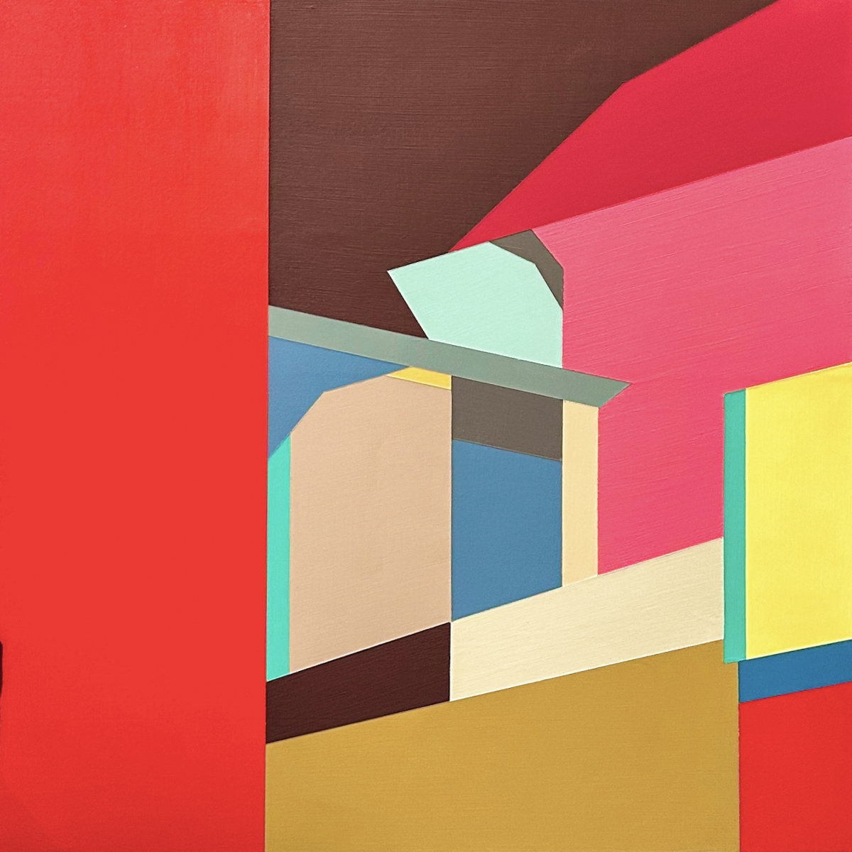
Sure, I accept that label; that is what the work is: it's hard-edge. That doesn't mean it's going to be that way forever or that I'm stuck doing hard-edge forever. But for now, yes, it's totally hard-edge. I'm interested in how the flat-color planes interact to create an undefined space on the panel.
Is there any link to LeWitt's systems, or is your process intuitive rather than rule-driven?
I don't have a set of rules or a system like Sol LeWitt's; all my paintings start off as random sketches on random pieces of paper, not even in a sketchbook. I do sometimes catch myself following a self-prescribed "rule" like "oh I can't make a shape like that", and then I think "how ridiculous, you can do whatever you want", and then I proceed to do whatever I want. My work isn't built on any sort of format or rule following. It's just what I feel looks balanced and pleasing.
Process & Format
Why wood panel, and why such small, square formats?
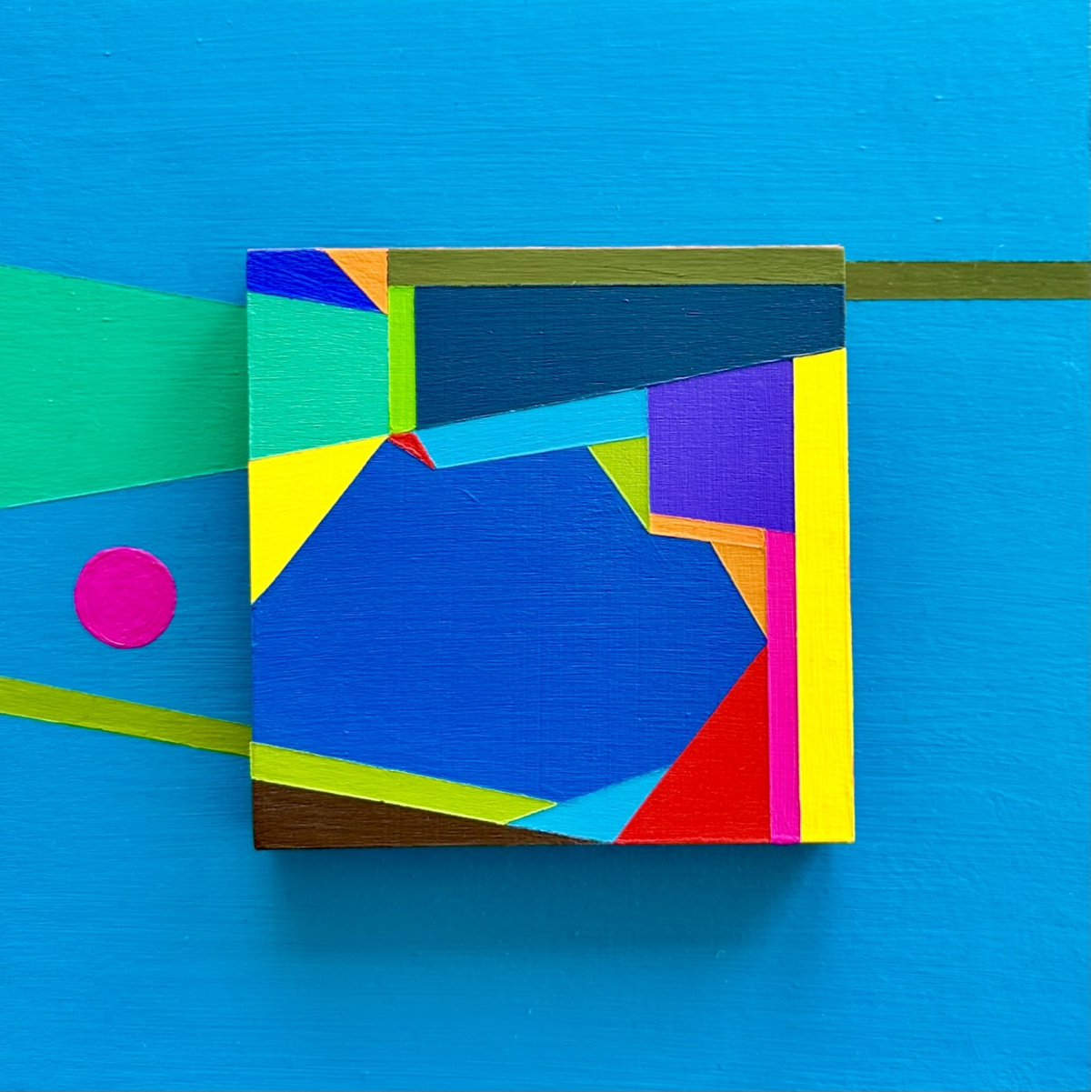
I started painting on plywood and wood scraps towards the end of my senior year of college and fell in love with the smooth, flat quality it gave the paint. Post-college, I didn't have a studio or access to a space to paint, so I started painting in my bed. Then I decided to work on wood because I didn't have to worry about poking or warping canvas, and I could stack finished paintings without worry. For Italy, I had to pack all my paintings in two hardshell suitcases because that's the system Jen uses, so the luggage space I had was limited, which is why all the work is 12"x12" or smaller. If I had more space, I would have brought larger work as well. When I had space, I was making much bigger paintings like 6ft by 4ft, but since my space is limited these days, the biggest I make right now is 30" x 30".
As for why the square format, I honestly just like working with the symmetry, how my work hangs together, and the cohesiveness of a collection when they are all the same shape. I'm not married to the square, though; I'm working on a series right now that is 4"x12," which is a scale I haven't worked in before, but I'm really enjoying it. The scale influences the piece a lot as well; the new 4"x12" series only works at that scale, and I would never make it square because it would be a disservice to the composition.
What made you start stacking panels, as in Green Shock and Red Impact? Is it a structural decision or a compositional one?
To me, a lot of my paintings feel like still images of a larger imagined space, so I kept that "still image" in the 4"x4" center panel and then picked a few elements to expand out onto the 8"x8" panel. I think it brings a new dimensionality to the work that brings you into the imagined spaces more, or rather brings it out to you. It's all an aesthetic choice.
How do you decide where a color edge falls? Do you plan it or find it as you paint?
All my work is planned out ahead of time. I always start with just a pen and paper, rarely pencil or any other medium. I prefer cheap black or blue ballpoint pens, and I also don't keep a sketchbook. To me, life feels like a performance enough, and I'm constantly trying to break away from that feeling of performance, and for some reason a sketchbook makes me feel that same sort of pressure, like "oh I have to show someone this", which obviously isn't true and I don't think many artists feel that way, but that's how I feel, so I sketch on loose scrap paper or in old lined notebooks, usually on top of or around old notes from college courses.
From there I'll take a picture of it and put it in Procreate on my iPad, and that's how I clean up the composition and pick my color palette. Once I'm happy with how it looks on the iPad, I'll transfer that to my wood panels with colored pencil. I don't make a grid or anything, so it usually ends up a little different from the iPad drawing.
How do you pick palettes? Do you mix your own colors?
I usually have a color in my head that I want to be the focal point or "theme" for a piece as I'm drawing it, and then I go from there. I've created many color palettes and saved them in Procreate, so I have a lot to go off of. Honestly, the colors tend to come naturally to me, and I don't think that hard about it; it's just what feels right and feels balanced to me. I mix all my own colors, and I work with acrylic, so I mix them in little sauce containers so I can keep them all. I have many bins full of little sauce containers that I should definitely work on organizing, but it's an overwhelming amount.
Concepts
What is the "unseen geometry" in your work?
I didn't come up with that phrasing, but when I read it in the press release, I thought it was in reference to the expansive nature of my work. I talk about this in question 6, but when I'm painting, it feels like a snapshot of a larger image or space. Like I can physically put myself into my paintings and see them as three-dimensional spaces, and I'm only showing you one view of the space in the painting, and the "unseen geometry" is the expansive imagined world where the view comes from. At least that's how I would explain that phrasing.
Many titles are emotional or narrative, such as "When the Circus Comes to Town," "Waiting Patiently," and "Neighborhood Blues," while the paintings are abstract. When does the title come in, and what should it do for the viewer?
The titles are the last thing I do when I make a collection of work. Or really, I only name them if they are going to be shown, because if everything was "untitled," I think it would drive people a little crazy. I don't put inherent narrative into my paintings when I'm making them, so the titles are really just the first things that come to mind that I feel describe the piece without really describing it. I guess the titles act as a bit of guidance for the viewer, but I kind of wish they didn't. I really want people to bring their own feelings and thoughts to the work and not be influenced by the title, but that's inevitable.
The Space Series is numbered, and the rest are titled. Why the difference?
I prefer for things not to be named, so when I make mini series that look very similar to each other, I usually just title the series and add 1, 2, etc. for the title. I think of them more as a group or as one piece rather than individuals. Kind of like multiple snapshots of the same imagined space like I wrote about in previous questions.
Do you think of these as icons, and do you want viewers to feel something close to devotion?
Short answer: no. Long answer: No, I think that the word icon holds a lot of weight and again feeds into the feeling of performance that I am trying to get away from in my daily life. I don't paint to show others or for admiration or really for any external reasons. I paint because I have to; it's like a compulsion, for lack of a better word. It's something I have to do; it's something I feel compelled to do. I would still be painting even if no one cared. And I feel very lucky that people do care, and I think it's very kind that my work has been described in such a way as "icons," but I personally wouldn't.
Venice
This is your first solo show in Europe. How did the context, with the Biennale and its theme In Minor Keys, change how you think about the work?
I honestly didn't think too much about the theme while creating the work because I felt like my work already fit within the context without having to change anything or the way I work. I think the paintings are like little portals to other worlds and imagined spaces, and I think they invite the viewer to feel however they wish; they don't demand a certain emotion and allow you to think freely and feel freely in a contemplative nature.
How did the Castello 925 annex space shape the hang?
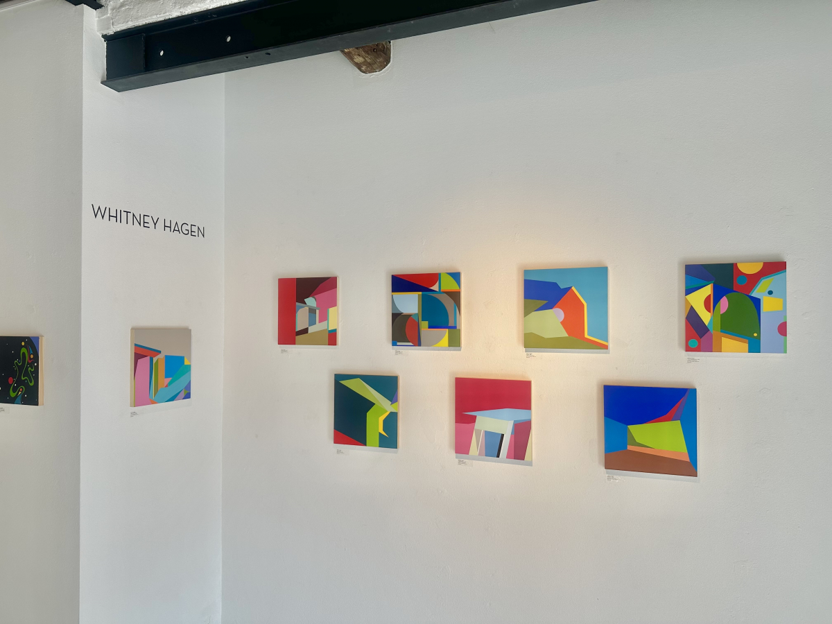
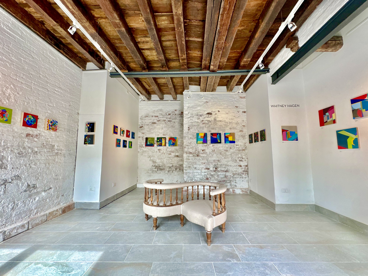
I had no plan for how I was going to lay out the show, and honestly, at first I was nervous that I didn't bring enough work, but it ended up working out perfectly. As I started pulling out paintings, I just started grouping them by size and form against the walls, and it just kind of all fell together. I hung all the work by myself, which I was happy to do because that is my actual profession. I've worked at the Newport Art Museum for over 2 years now as their lead preparator and art handler, so I hang all the shows there, and I hang all the shows at Jessica Hagen Fine Art, as well as freelance contract work. I'm very happy with how the show in Venice turned out, and I think the contrast between the old white brick walls and my flat color planes works very well.
What has Venetian color, such as the light, the water, and the old painting, meant for you?
This was my first time in Italy, and Venice was incredibly inspiring to me. I took hundreds of pictures of the buildings and the water, and not to mention the Biennale was also incredible. I was constantly shocked by the lighting and how different it felt there.
Career
How did the Hudson Valley and New England shape you, and how does it feel working from Newport?
Honestly, I'm not sure if I'm consciously aware of how New England has influenced me. Surely the water and the light have caused a great impact; I think a lot of my work reflects light in the colors and angles I choose, and I think my more fluid squiggly forms reflect the movement of water. I do think a lot about water when I'm sketching, mostly the reflections of light on the surface. I love working from Newport; it's my home, and I feel the most like myself when I'm near the water. My roommate in college was from Miami, and we shared an affinity for the water, and multiple times during our years there we would get a car in the middle of the night and drive to the nearest coast, which was somewhere in CT, and we would just sit by the ocean. The Hudson River is beautiful, but nothing compares to the ocean.
Is there a next series, or a direction this show opened up?
>I'm working on a collection I'm calling the "Signature Series", which consists of these freeform squiggles on 4"x12" wooden panels and, usually accompanied by a circle or two, and to me they feel like handwriting, all inspired by the surface of water. I'm also just creating larger works because I wasn't able to bring anything big to Italy. Since I've been home, I've made a few larger-scale pieces and have many, many drawings to work off of for more.
What is it like showing in your mother's gallery?
My mom is the hardest-working person that I know, and I am very lucky to have been brought up in the art world and to have the connections I do. I am very thankful for my mom. I've also grown up around this group of artists that she represents; they have all known me since I was like 5 years old, so they've seen me grow and change, and it is incredibly valuable to me to hear their opinions and to work closely with them when I hang their shows. I’ve learned a lot growing up in that environment, and it is not lost on me how lucky I am to have had that.
--------------------------------------------------------------------------
CASTELLO 925
Castello 925 is a multi-disciplinary, non-profit gallery that serves as a crucible for the visual arts, literature, and culture, exploring the origins of creativity with a vibrant program of exhibitions and conversations. Founded in Venice, Italy by psychoanalyst Dr. Luca Caldironi, Castello 925 is affiliated with Cross Contemporary Projects in Saugerties, NY, and will open an art residency in Tangier, Morocco in 2027.
You can also view an interview with Luca and Whitney Hagen on YouTube here: https://bit.ly/whagenconv